Html5 Tumblr Mobile App Part One
Hi Folks. It's time to build our first native app using web technologies. We are going to build a simple photo gallery app using images from my Meow Reader Tumblr. The code presented should be flexible enough to turn any Tumblr into an app.
A web-based demo of the completed app can be viewed using your desktop or mobile browser, or download the app to your Android phone by following this QR Code. Play around with this demo a bit to get a better idea of what we will be developing.
This tutorial will be split into three parts. In this post we will write the HTML, CSS, and Javascript required to make a web-page look and act like an app. In part two, we will work with the Tumblr API to pull in our photos. In part three, we will use PhoneGap to convert our mobile web app into a native app. We will then deploy to Google Play / the Android Market.
Game Plan
In this post we will be developing the following parts of our app:
- The HTML Markup - Our entire app exists within a single HTML5 document.
- The CSS Styling - We use CSS to make our page look like an app.
- Sub-Page Navigation - A Javascript/DOM menu allows navigation between various sub-pages.
- Performance Tuning - We use Javascript to remove the click-event delay introduced by mobile web browsers.
A Word on Frameworks
There are a number of HTML5 frameworks we could have used to build our UI. We will explore some of them in future posts. For this tutorial, however, we will be coding without a framework so that we can get a better understanding of the quirks of mobile web development. I am therefore assuming an intermediate knowledge of HTML5 and CSS3, along with an understanding of Javascript and DOM manipulation. For a quick review of these skills in a mobile context, read my previous post on HTML5 mobile web-app tools.
The HTML Markup
All of the markup for our app will be stored as a single index.html file. We will be using the DOM to allow the user to navigate to various "sub-pages" within our single-page app. The base markup for our app will be:
<!doctype html>
<html lang="en">
<head>
  <meta charset="utf-8">
  <title>Meow Reader</title>
  <meta name="HandheldFriendly" content="True">
  <meta name="MobileOptimized" content="320">
  <meta name="viewport" content="width=device-width, initial-scale=1.0, maximum-scale=1.0, user-scalable=0">
  <link href="css/style.css" type="text/css" rel="stylesheet" />
</head>
<body>
  <div id="main" role="main">
  </div> <!-- end #main -->
  <!-- External Javascripts will be loaded here. -->
</body>
</html>
Hover your mouse over the code to see the longer truncated lines.
The meta elements within the head ensure that our page will be read as mobile friendly markup. The viewport entry disables user-zooming and ensures that we are scaled to fit the actual width of our mobile screen. It also fixes an oritentaion-change bug on iOS devices.
Some developers see disabling the user's ability to zoom as an anti-pattern, but I find that it simplifies things. There are, however, ways to get around the iOS bug without disabling zoom if you are so inclined.
Single Page Navigation
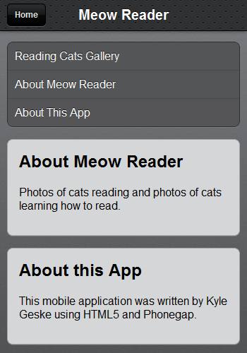
The home "page" of our app will display a top toolbar, along with a naviation menu. I have implemented the menu as an unordered list of links:
<!-- This toolbar will appear at the top of all pages. -->
<div id="toolbar">
  <a href="#home" id="back_button" class="hidden">Home</a>
  <h1>Meow Reader</h1>
</div> <!-- end .toolbar -->

<!-- When our app is loaded this home screen menu will be visible. -->
<div id="home" class="screen">
  <ul class="buttons">
    <li>
        <a href="#" id="launch_link">Reading Cats Gallery</a>
    </li>
    <li>
        <a href="#about_meow" class="switch_screen">About Meow Reader</a>
    </li>
    <li>
        <a href="#about_app" class="switch_screen">About This App</a>
    </li>
  </ul>
</div> <!-- end #home -->
The first link in this list will eventually launch our photo slideshow, but for now it will do nothing. For the remaining two links, we will use Javascript to "link" to seperate sub-pages. Each of these sub-pages will be created as a div element. These divs will be placed below the navigation menu:
<!-- This sub-page should be loaded by clicking the #about_menu link. -->
<div class="screen hidden" id="about_meow">
  <h2>About Meow Reader</h2>
  <p>Photos of cats reading and photos of cats learning how to read.</p>
</div> <!-- end #about_meow -->

<!-- This sub-page should be loaded by clicking the #about_app link. -->
<div class="screen hidden" id="about_app">
  <h2>About this App</h2>
  <p>This mobile application was written by Kyle Geske using HTML5 and Phonegap.</p>
</div> <!-- end #about_app -->
CSS Styling
For the look and feel of the application we are going to borrow heavily from the JQtouch project. JQtouch is a Zepto/Jquery plugin for mobile web development. I've taken portions of the JQtouch default CSS theme to style our app. Specifically I'm using the JQtouch styles for our navigation menu and the top toolbar.
I placed all my styling rules into a style.css file within a css sub-folder. The full extent of my CSS pilfering can be seen as a github gist. Note that I also added the following CSS to style our "sub-pages":
#about_meow, #about_app {
  background-color: #D5D6D7;
  margin: 15px 10px 17px 10px;
  -webkit-box-shadow: rgba(255, 255, 255, 0.15) 0 1px 0;
  box-shadow: rgba(255, 255, 255, 0.15) 0 1px 0;
  border: 1px solid #a5a6a7;
  -webkit-border-radius: 8px;
  border-radius: 8px;
  padding: 1em;
}

#about_meow h2, #about_app h2 {
    margin-top: 0;
}

#about_meow a, #about_app a {
    color: #3B59BB;
}

#about_meow blockquote, #about_app blockquote {
    margin-left: 0;
    margin-top: 2em;
    font-style: italic;
    font-family: serif;
}
With the CSS applied, our app is now starting to look like an app. Pretty snazzy, eh?
Javascript "Sub-Page" Navigation
Each "sub-page" in our app, including our home screen navigation menu, is a div with a class of screen. The id attributes of these elements each match an href fragment in our navigation list links. For example, the second navigation link has an href of #about_meow. It will be used to navigate to the div with an id of about_meow. Note that the back button in the toolbar has an href that matches the id of our navigation home screen div.
By default we want to hide the toolbar's back button and the two "about" subpages. If you look back to the HTML, you'll see that these elements have a class of hidden applied to them. We will define this class like so:
.hidden {
    display: none;
}
We are going to use this class along with some Javascript to hide/show DOM elements. Let's build a hide and a show function that use className property of the provided DOM elements to add/remove the hidden class. Using these functions we will create another function called switch_screen that allows us to specify, by id, which sub-page to display. This function will hide all divs with a class of screen and then show the requested div. It will also toggle the visibility of the back button in the toolbar.
// Hide any DOM element by adding the CSS class "hidden",
// unless the class is already present.
function hide(el) {
  if (el.className.indexOf('hidden') === -1) {
    el.className+= ' hidden';
  }
}
// Unhide any DOM element that was previously hidden using
// the CSS class "hidden".
function show(el) {
  el.className = el.className.replace(/ ?hidden/gi, '');
}
// Hide all div.screen elements and then show the div with
// the requested id.
function switch_screen(id) {
  // Remove the hash sign from the start of the id.
  id = id.substring(1);
  var current_screen = document.getElementById(id),
      back_button = document.getElementById('back_button');
  // Find all div.screen elements and hide them.
  [].forEach.call(document.querySelectorAll("div.screen"), function(el) {
    hide(el);
  });
  show(current_screen);
  if (id !== "home") {
    show(back_button);
  } else {
    hide(back_button);
  }
}
We can now bind the bottom two navigation links to this switch_screen function. We will bind the back button to this function as well. We will do this, when the DOM is ready, with a little helper function called set_click. This set_click function takes as arguments an element and a callback function. It overrides the default click action of the element with the supplied callback.
// Helper function the simplify setting click events on elements.
// The callback_fnc provided should be defined with one parameter,
// which will be set to the clicked element when executed.
function set_click(el, callback_fnc) {
  el.addEventListener('click', function(event) {
    // Supress the default click action of links.
    event.preventDefault();
    callback_fnc(el); // Hand off the element in case it's required in our callback.
  }, false);
}
// Execute the provided anonymous function when the DOM is ready.
document.addEventListener("DOMContentLoaded", function() {
  var back_button = document.getElementById('back_button');
  // Set the switch_screen callback for the toolbar back button,
  // passing the link's href value as the argument.
  set_click(back_button, function(e) { switch_screen(e.getAttribute('href')); });
  // Bind each of the buttons on the home screen to a switch_screen callback.
  // Use each link's href value as the switch_screen argument.
  [].forEach.call(document.querySelectorAll("ul.buttons a.switch_screen"), function(el) {
    set_click(el, function(e) { switch_screen(e.getAttribute('href')); });
  });
});
Click Delays
A working version of our code up to this point can be tested using your web browser, or by scanning this QR Code.
Try navigating to our two sub-pages using the bottom two links in our navigation menu. Use the back button in the toolbar to return to the main menu. Depending on your smartphone you may have noticed a slight delay when navigating our menu. The delay will likely be in the 300 to 400 milisecond range.
Depending on the mobile browser a finger tap will result in the following events being fired:
- touchstart
- touchend
- mousedown
- mouseup
- click
Mobile browsers typically introduce a 300ms delay after touchend, so that the browser can determine if the user is performing a gesture rather than a click. This might be acceptable while navigating the web, but we want our mobile app to feel snappier. To solve this problem we are going to bind our navigation actions to touchend rather than click. I used a version of Matteo Spinelli's iPhone solution which I modified for Android support.
Links are enhanced using this script as follows:
new NoClickDelay(document.getElementById('id_of_link_element'));
In order to apply this to all my links I modified my set_click function:
function set_click(el, callback_fnc) {
  // Are we on a touch device? i.e. is ontouchstart present?
  if('ontouchstart' in document.documentElement ) {
    new NoClickDelay(el, callback_fnc);
  } else { // For non-mobile browsers.
    el.addEventListener('click', function(event) {
      event.preventDefault();
      callback_fnc(el); // Hand off the element in case it's required in our callback.
    }, false);
  }
}
This fix isn't perfect. I'm still experiences some "ghost click events" that fire after the navigation callback is called. In the future I may use the HTML5 Boilerplate FastButton Solution or the Tappable library.
All of our Javascript files should be placed in a js sub-folder within our project folder.
Conclusion
The final working version of our code for part 1 of this tutorial can be tested using your web browser, or by scanning this QR Code.
In this tutorial we developed a simple single-page navigation system and replicated the default JQtouch mobile app theme. The code we developed should work equally well as a mobile web app on Android and iOS devices. If you have any questions or suggestions for improvements, please leave a comment below.
In part 2, we are going to use the Tumblr API to import our slideshow images from my Meow Reader Tumblr. The slideshow itself will be implemented using either Photoswipe, Swipeview or Swipe.js.
In part 3 we will use Phonegap to convert our mobile web app into a native app.